For the second half of the summative task, I created a series of logos/emblems for our group. We came up with the company name ‘Greta Thunberg’s Fanclub’, which stuck until the end. I created 2 logos with the name ‘Greta Thunberg’s Fanclub’ and another logo which took the board games name ‘Save us or die’.
For my first logo, I created a dripping effect coming from the earth which is meant to resemble what climate change is doing to our world. The dripping effect I used is meant to show the disintegration of the earth and how it is slowly falling apart due to climate change, unless changes are made. I thought this logo design was simple, but sends a powerful message about what is happening to our world.

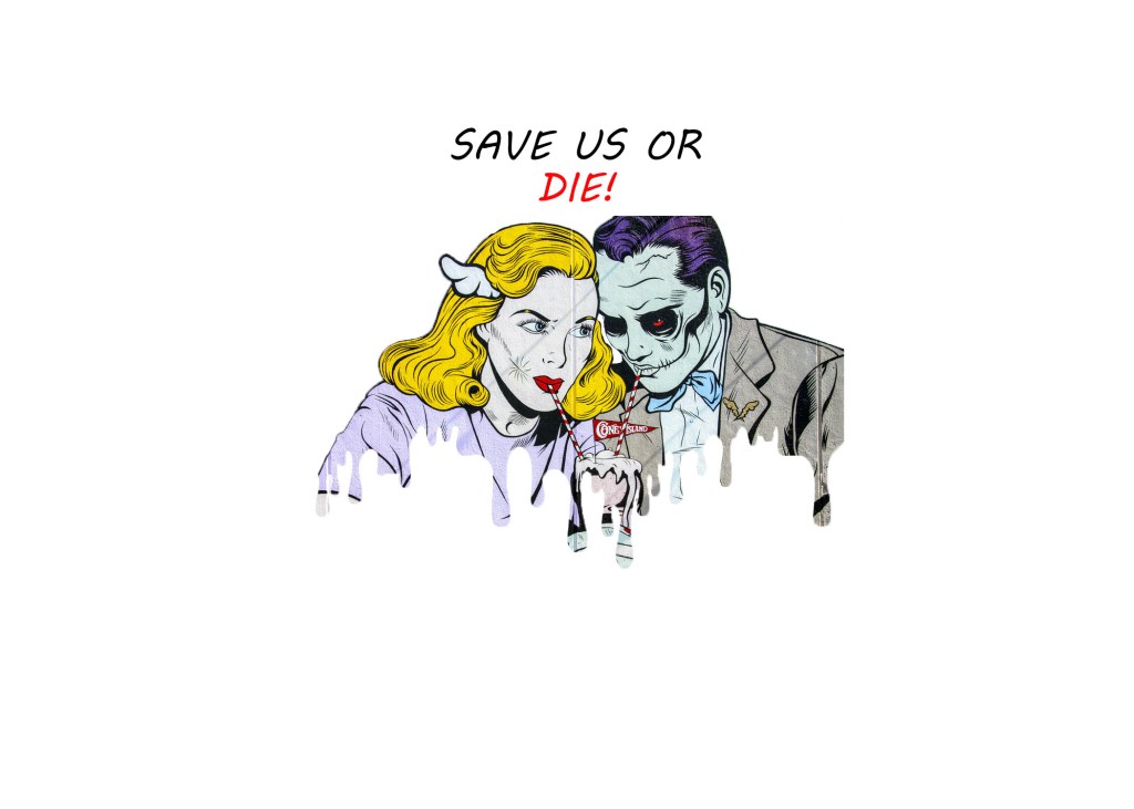
However, I thought that maybe this logo may have been too simple so I created a very different styled logo which took after the style of our board game which was a 1950s propaganda approach. The art style used in this logo is very similar to the art style which was used in propaganda during the 1950s e.g. nuclear scare propaganda posters, which inspired our board game.
For my third logo design, I reverted back to the same style in my first logo which showed the harm of climate change on our world. I felt this logo would have been more fitting as it shows we should care for our world and look after it, which is the message that Greta Thunberg sends. The hands around the world look as if they are embracing it.
